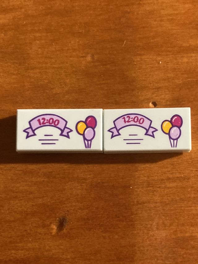
It comes with both a standard and bold font. It seems everything on the bold
one has bigger lines, and everything on the standard one has thinner lines. If
you think it's worth splitting the entry, I can supply you with a better
image of each if you wish
This looks like a normal variation to me where one just got more ink than the other. In Catalog Requests, The_RealRedHex writes: [...] (27 months ago, Mar 11, 2022, to Catalog Requests)
[...] I would say that this is just normal print variation. I don't think anything needs to be added or split. Cheers, Randy (27 months ago, Mar 11, 2022, to Catalog Requests)